Heron
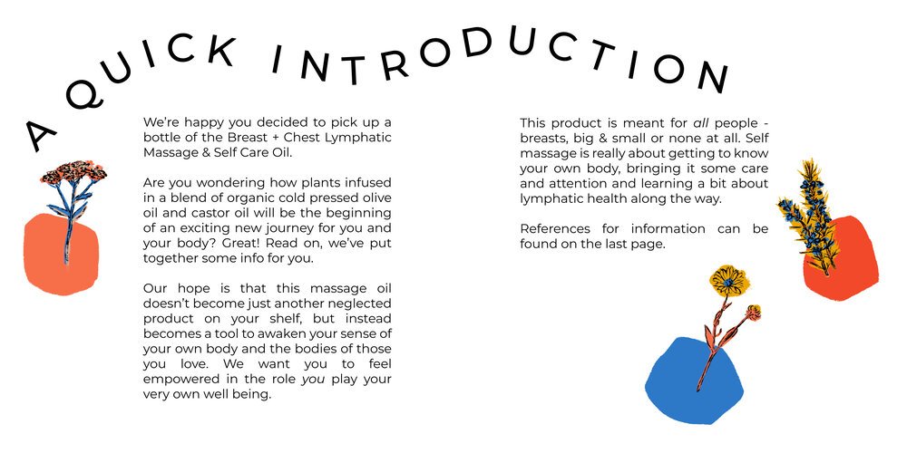
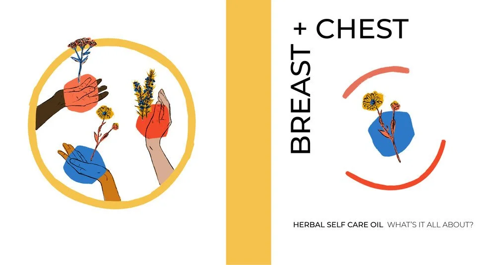
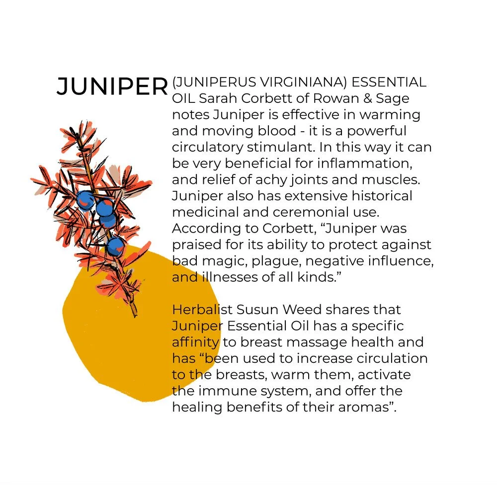
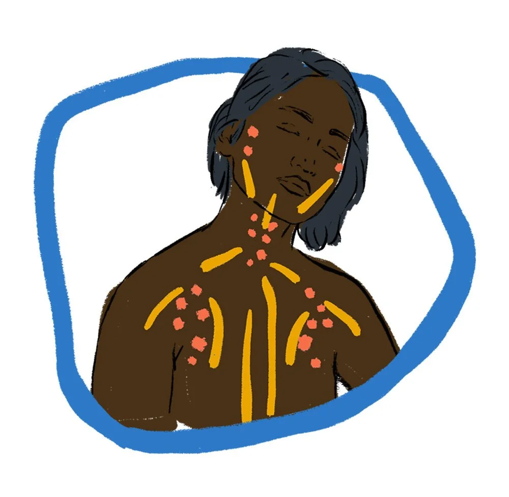
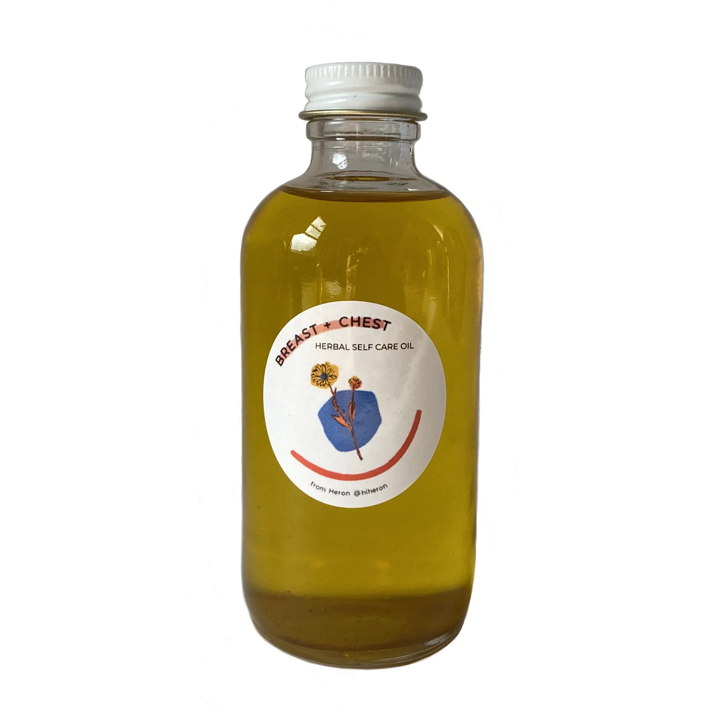
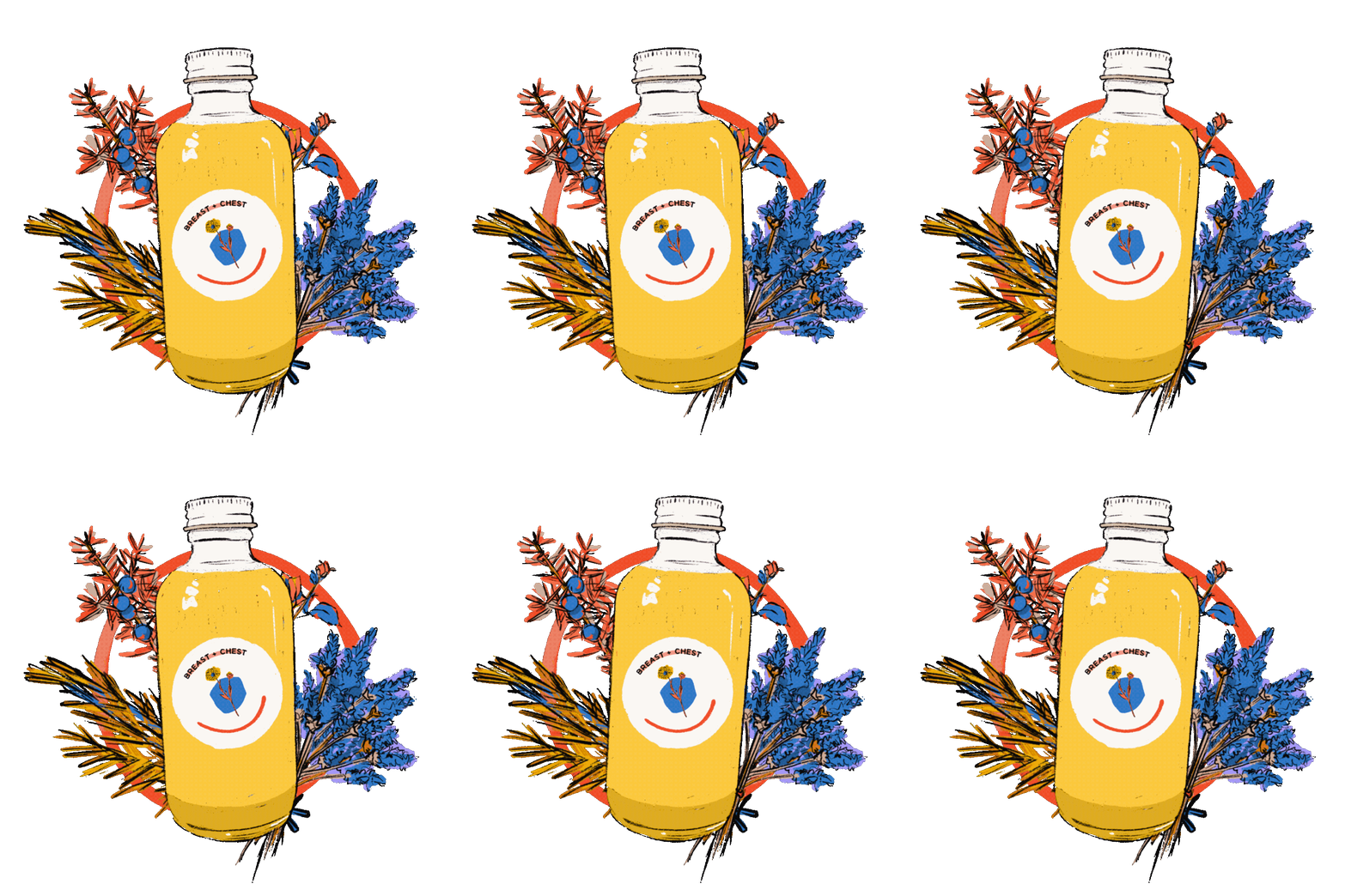
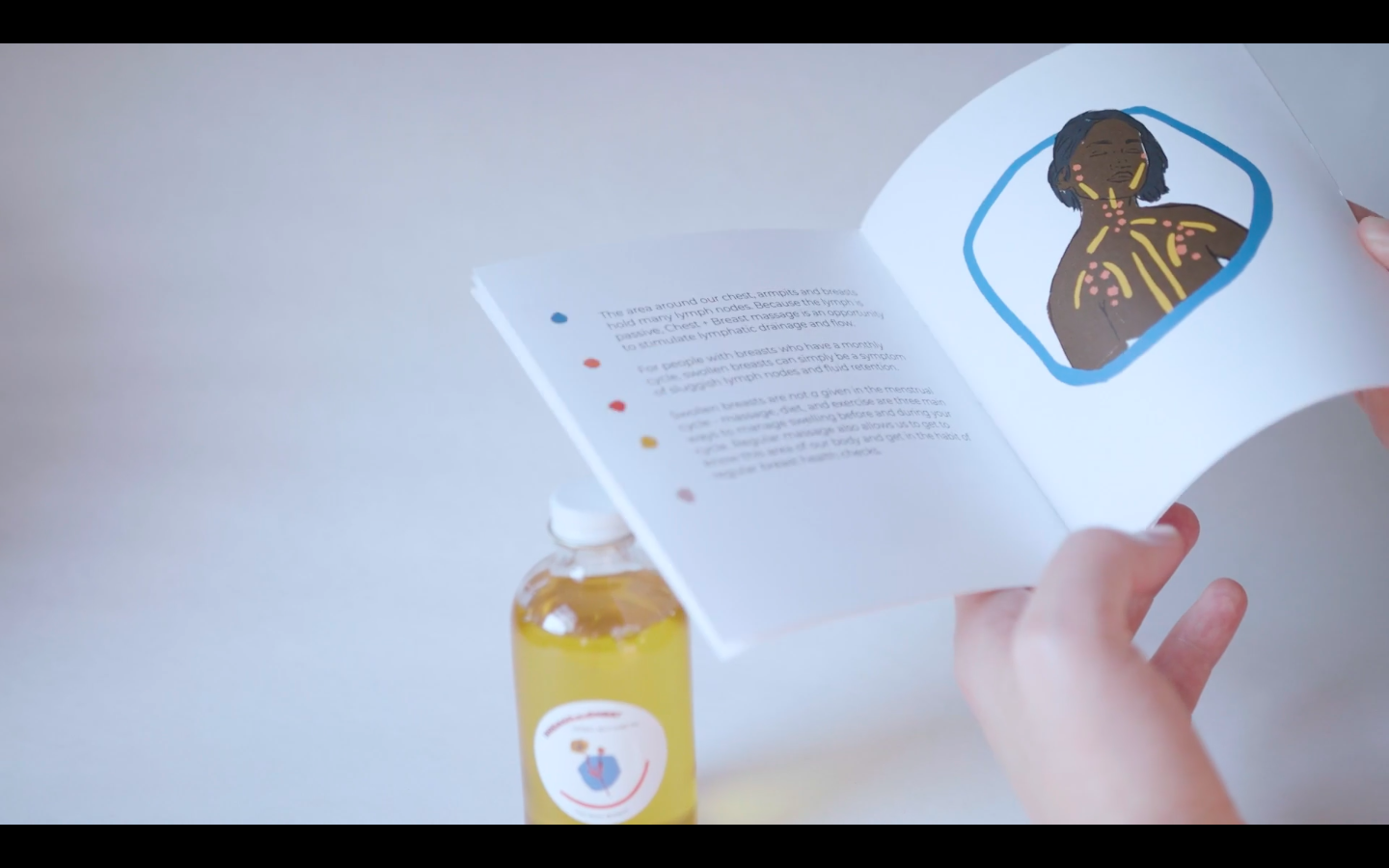
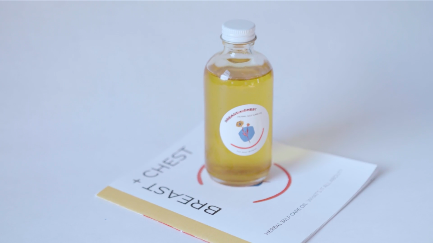
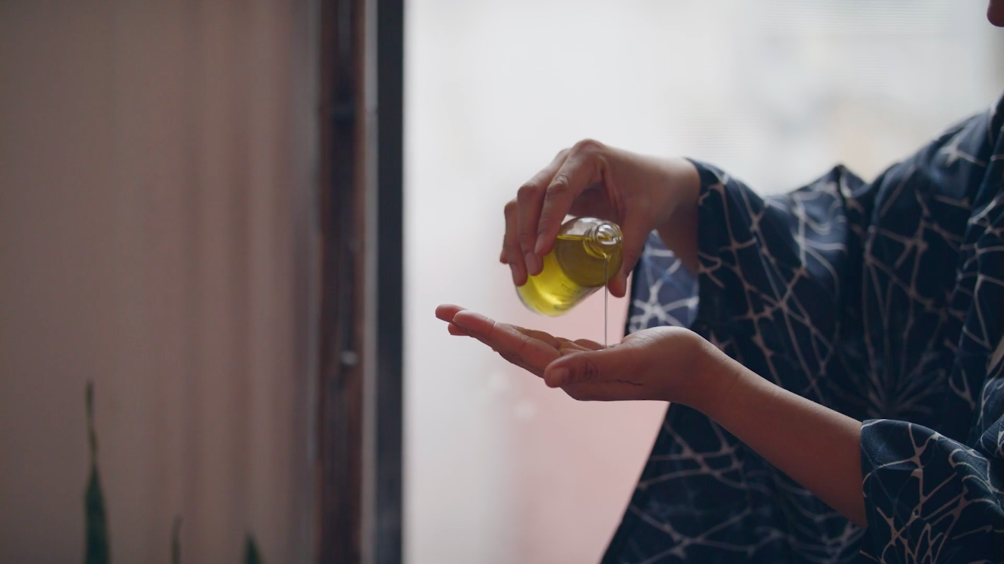
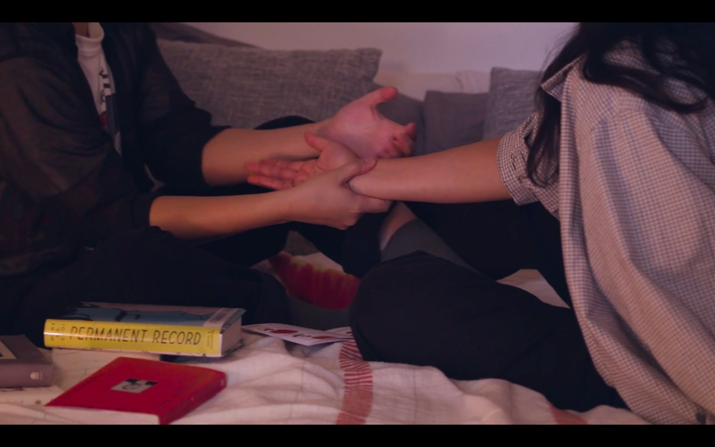
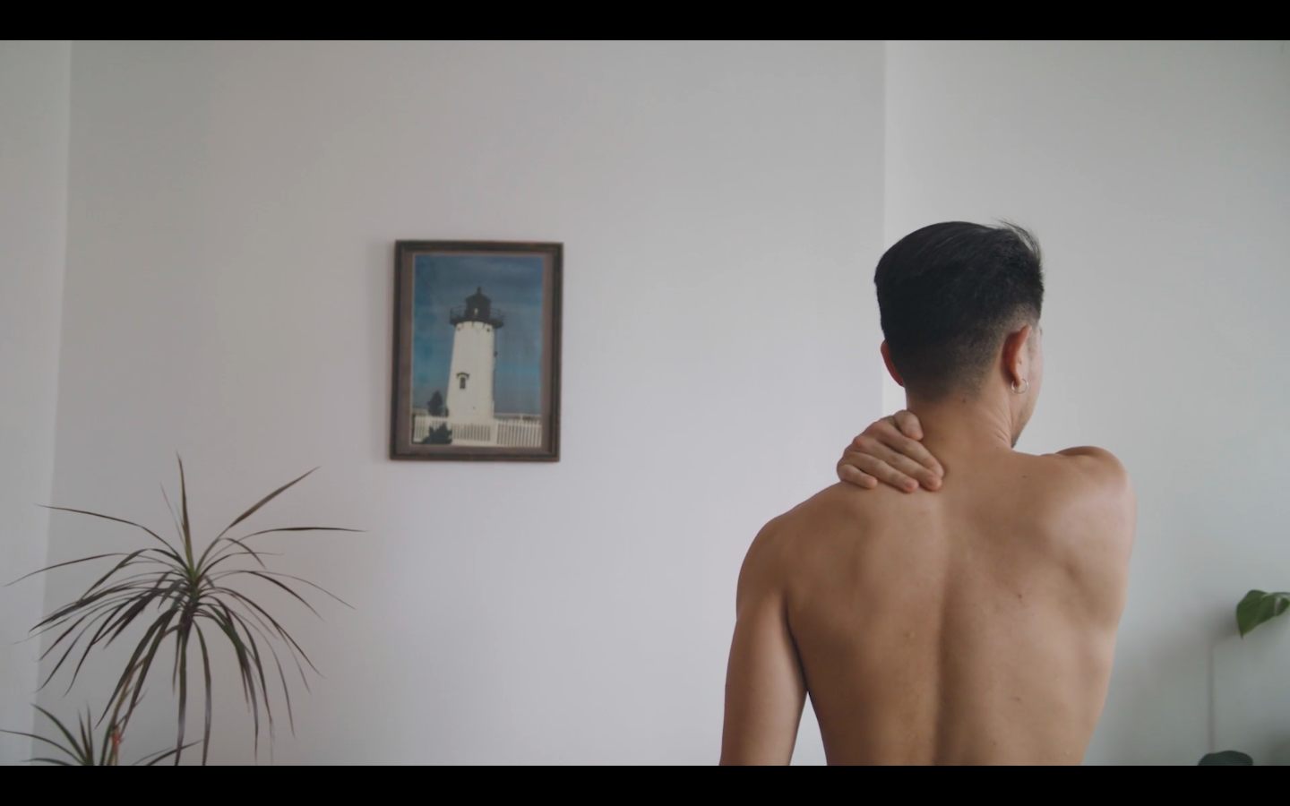
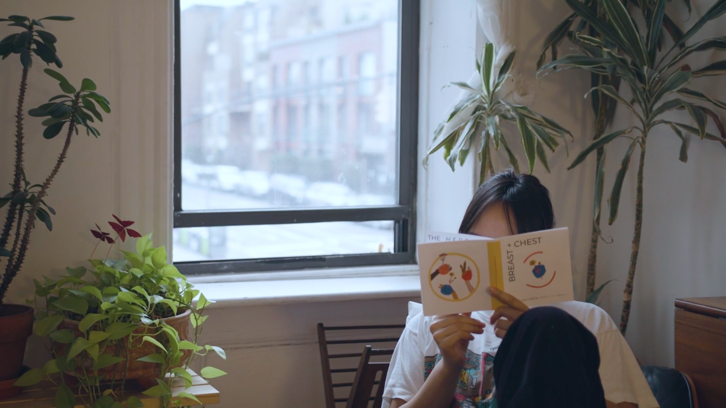
HERON was a small-batch herbal wellness brand centered on thoughtful self-care rituals and plant-based body care. Created during the pandemic, the project sought to make herbalism and lymphatic self-massage more approachable through beautifully crafted products paired with accessible educational resources. Alongside a line of herbal massage oils, we created an illustrated zine to introduce the benefits of lymphatic massage and encourage a deeper connection with the body.
I developed the visual identity, illustrations, packaging, and editorial design, creating a cohesive brand experience that paired handcrafted herbal products with an illustrated educational guide and a promotional video. The project combined storytelling, information design, and botanical illustration to make wellness feel approachable, inclusive, and visually engaging.

Jazzed On Grains
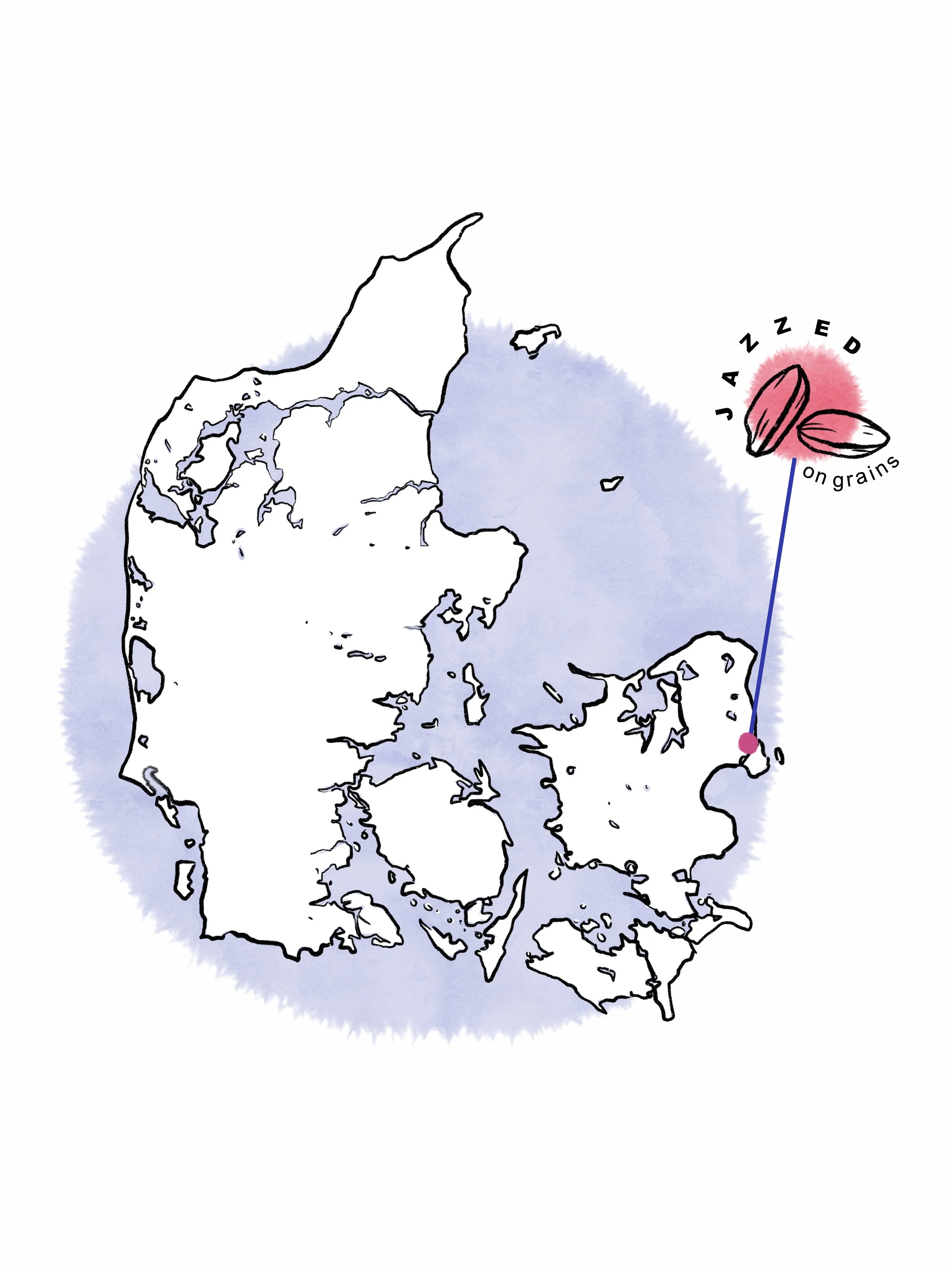
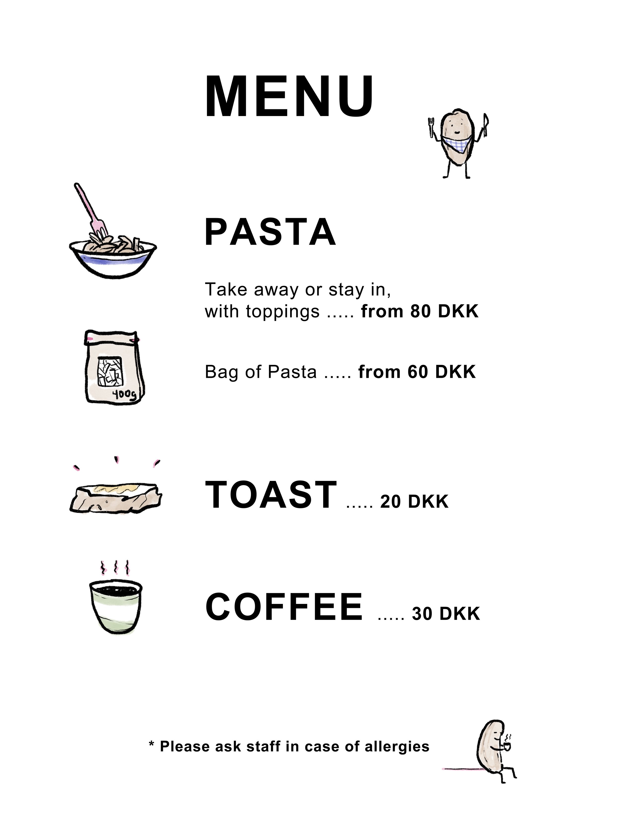
Jazzed on Grains is a Copenhagen-based pasta studio dedicated to celebrating the flavor, diversity, and sustainability of organic Danish heritage grains. Working closely with local farmers, millers, and seed breeders, the company champions regenerative agriculture and traditional grain varieties, creating small-batch pasta that reconnects people with the origins of their food.
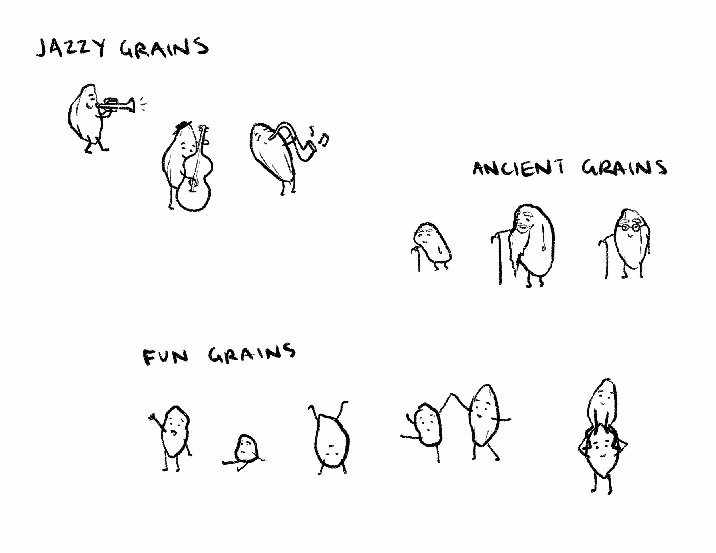
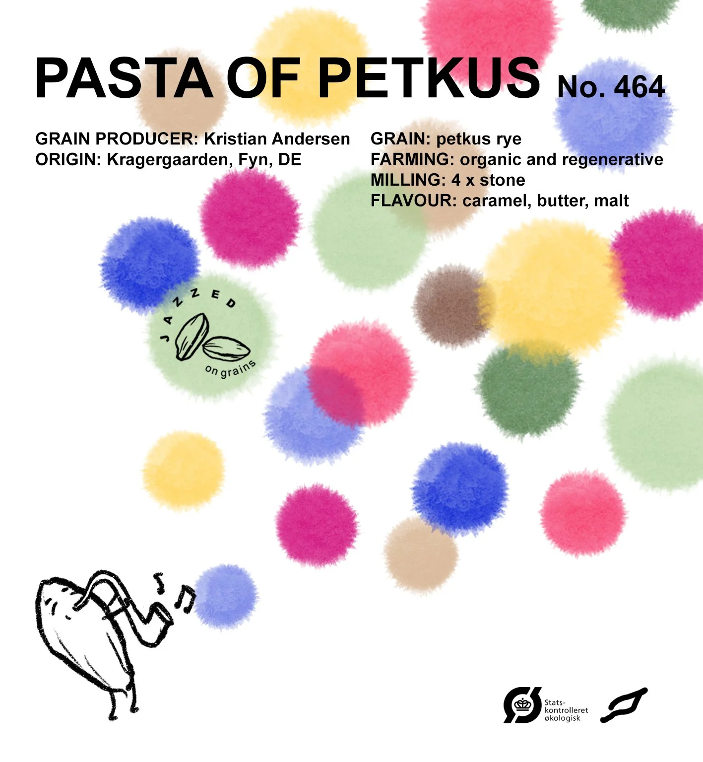
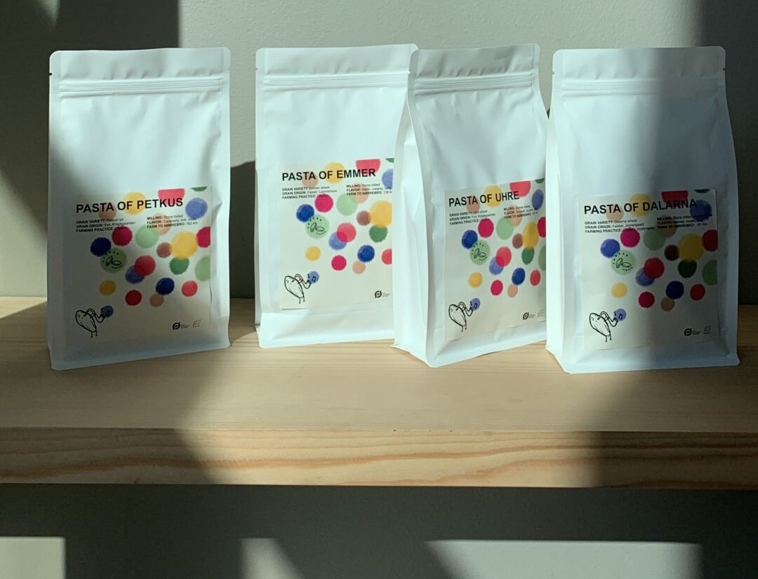
I developed the brand's art direction, visual identity, illustration system, and packaging design, creating a playful visual language that reflects both the environmental mission and joyful spirit of the company. Beginning with a restrained palette of black, white, and warm neutrals accented by vibrant colors, I designed a flexible identity that feels fresh, expressive, and contemporary. Hand-drawn grain "mascots," product illustrations, packaging, and in-store graphics work together to personify the grains and celebrate the individuality of each variety, transforming a story about sustainability into one of curiosity, character, and delight.